How to Create a Gallery Wall That Tells Your Story
Create a personalized gallery wall with curated art, designer tips, and layout strategies from the experts at Furnitureland South.

There’s a moment in every home — usually on a long, empty wall — when you realize the room needs something more. Not another piece of furniture, not another lamp. Something personal. Something that says, this is who we are and where we’ve been.
That’s exactly what a gallery wall does, and it’s one of our favorite interior design touches to help clients create. Done well, a gallery wall brings warmth, depth, and real character to a room. It turns a blank surface into a living conversation — a collection of art, photographs, and meaningful objects that grows with you over time.
If the idea feels a little daunting, we’re here to walk you through it. With nearly sixty years of helping families create beautiful homes, we’ve learned a thing or two about making a gallery wall feel effortless. Let’s get into it.
A gallery wall isn’t just decoration.
It’s the story of your home told in frames.
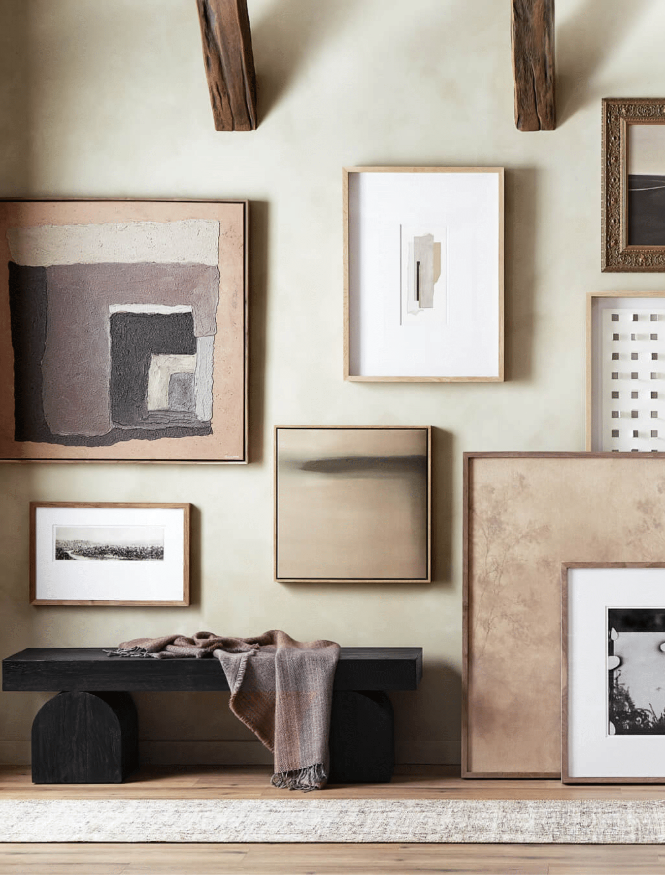
What Makes a Gallery Wall Work?
Before we talk about nails and the measuring tape, it helps to understand what separates a gallery wall that looks intentional from one that looks like a jumble of frames.
The best gallery walls share a few elements in common: a unifying thread (whether that’s a consistent frame finish, a shared color palette, or a common subject matter), a mix of sizes and orientations to create visual movement, and a clear focal point that anchors the whole arrangement.
Most importantly, they feel personal. The pieces don’t have to match perfectly — in fact, they shouldn’t. What matters is that each one means something, and together they tell a coherent story. Think of it less like hanging art and more like curating a small exhibition of your life.
Step-by-Step: Creating Your Gallery Wall
1. Find the Right Wall
Not every wall in your home is equally suited for a gallery display, and that’s okay. You’re looking for a surface where your eye naturally lands, a spot you pass often or see from where you sit every day.
Above a sofa is the classic choice, and for good reason. The horizontal expanse mirrors the width of the furniture below and gives the eye a resting place. A dining room wall you face during meals is another wonderful option, serving as the backdrop to countless conversations.
Entryways and hallways are often overlooked, but they’re ideal. A gallery wall in an entry greets every guest the moment they walk through the door, and a staircase wall lets the collection grow organically over time without ever feeling crowded.
What you want to avoid is a wall that’s too busy — one already competing with windows, architectural details, or furniture on both sides. Give your gallery room to breathe.
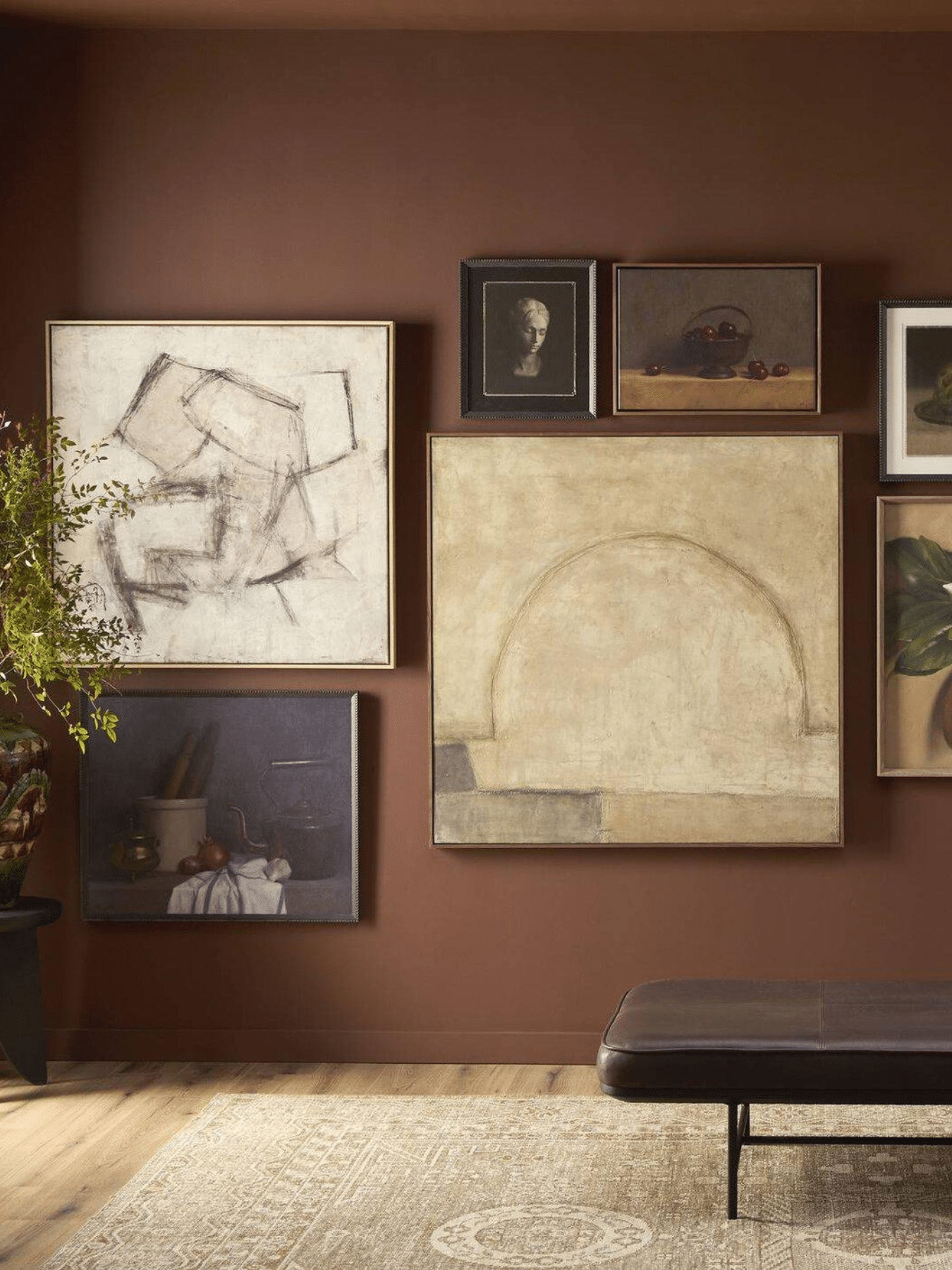
A Note on Wall Color:
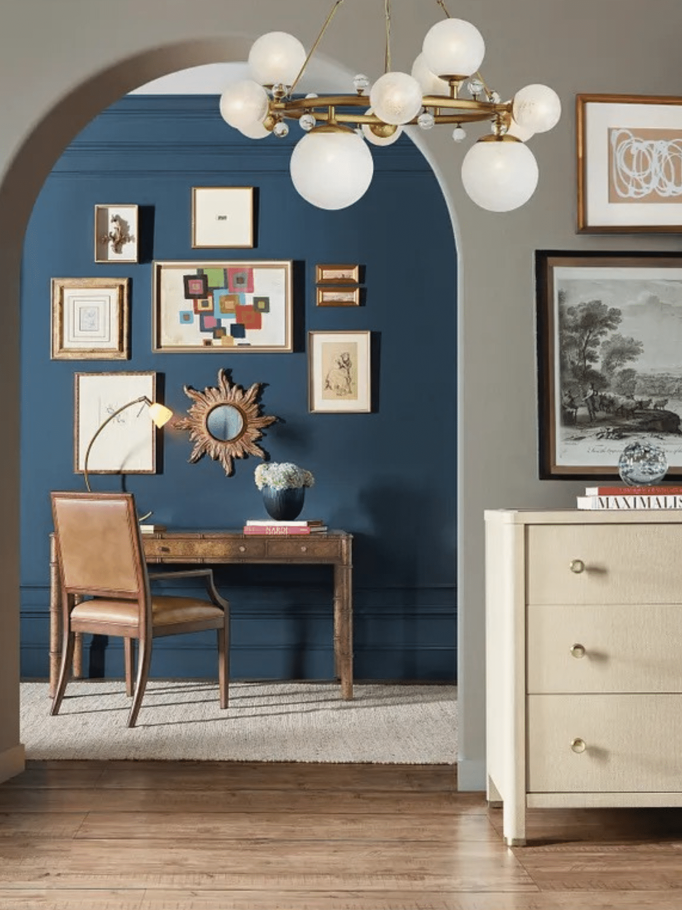
Gallery walls love contrast. If your walls are a warm white or soft neutral, nearly any frame finish will work beautifully. But don’t overlook the drama of hanging art against a deeper color — burgundy, navy, forest green, or charcoal can make gold frames and rich oil tones absolutely glow.
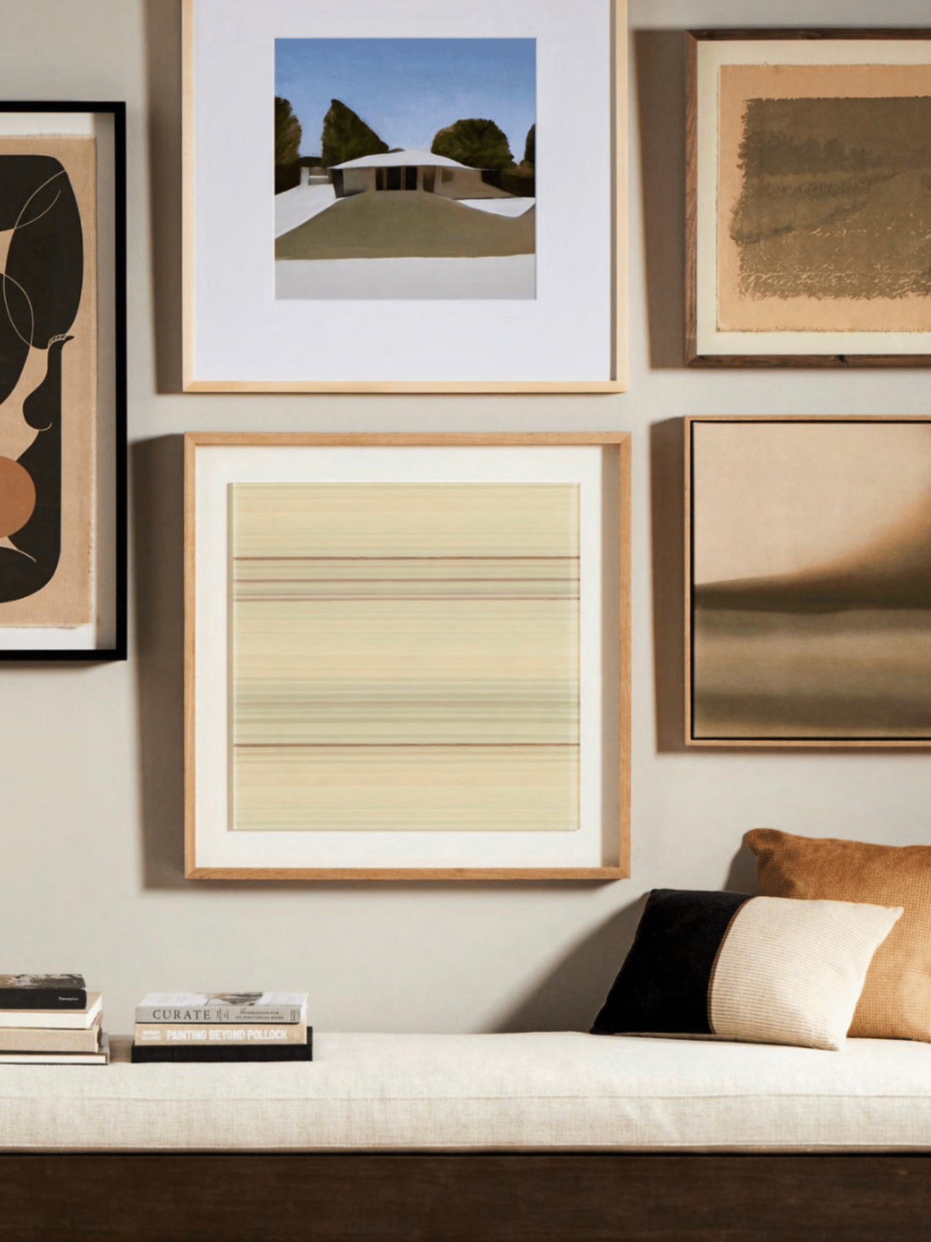
2. Gather Your Pieces and Look for the Thread
Here’s the most liberating advice we can share: there are no rules about what goes on a gallery wall. Framed prints, family photographs, small oil paintings, a vintage mirror, a piece of textile art, a clock, a relief sculpture — all of it is fair game.
What you’re looking for is a unifying thread that ties the collection together without making it feel matched. That thread might be:
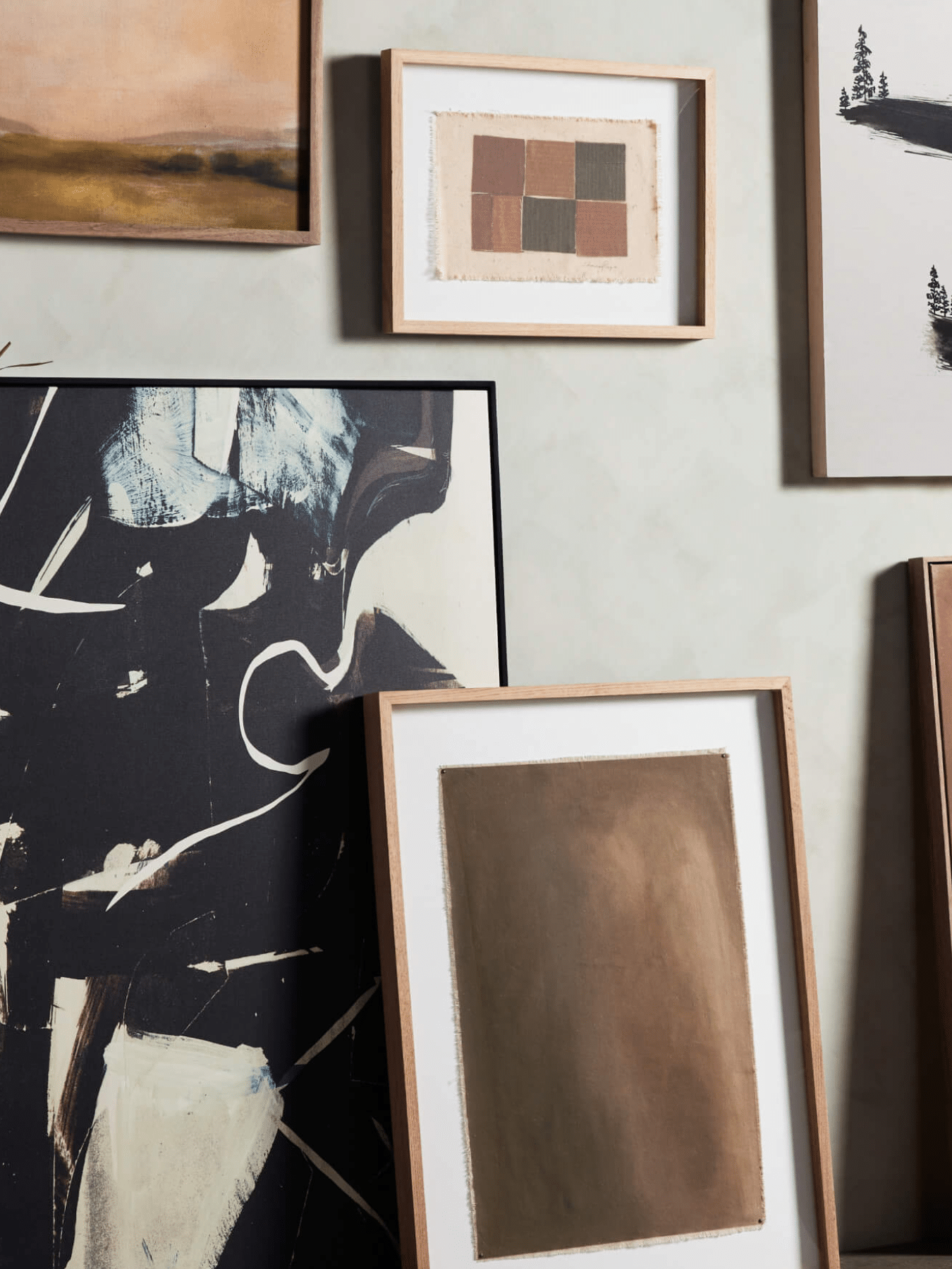
- A consistent frame finish (all black, all natural wood, all antique gold)
- A shared color palette in the artwork itself
- A common subject — botanicals, travel photography, portraits, landscapes
- A similar artistic style, from abstract to classical to graphic
You don’t need all of these; just one or two is enough to create cohesion. A mix of frame styles with a shared color palette, for instance, feels layered and collected without looking chaotic.
If you’re starting from scratch, resist the urge to buy everything at once. Gallery walls are better when they’re built over time. Start with pieces that genuinely move you, and let the collection grow.
The best gallery walls look like they were gathered, not purchased all at once.
Give yourself time to collect pieces that really mean something.
3. Plan on the Floor before You Touch a Wall
This is the step most people skip, and the one that makes the biggest difference. Before you pick up a hammer and nails, lay everything out on the floor.
Clear a space roughly the size of your intended wall and arrange your pieces there first. Start with your largest item — this is your anchor, and everything else will orient around it. Then layer in medium pieces, and finally smaller ones to fill the gaps and balance the visual weight.
Step back. Walk away and come back. Live with it for a day if you can. You’ll notice details you might miss in the moment: a cluster of frames that’s too heavy on one side, a small piece that deserves more prominence, a gap that could use one more element.
Once you’re happy with the arrangement, trace each piece onto kraft paper or newspaper, cut out the templates, and tape them to the wall. This lets you experiment with placement — moving pieces up, shifting left, adjusting spacing — without putting a single nail in your wall.

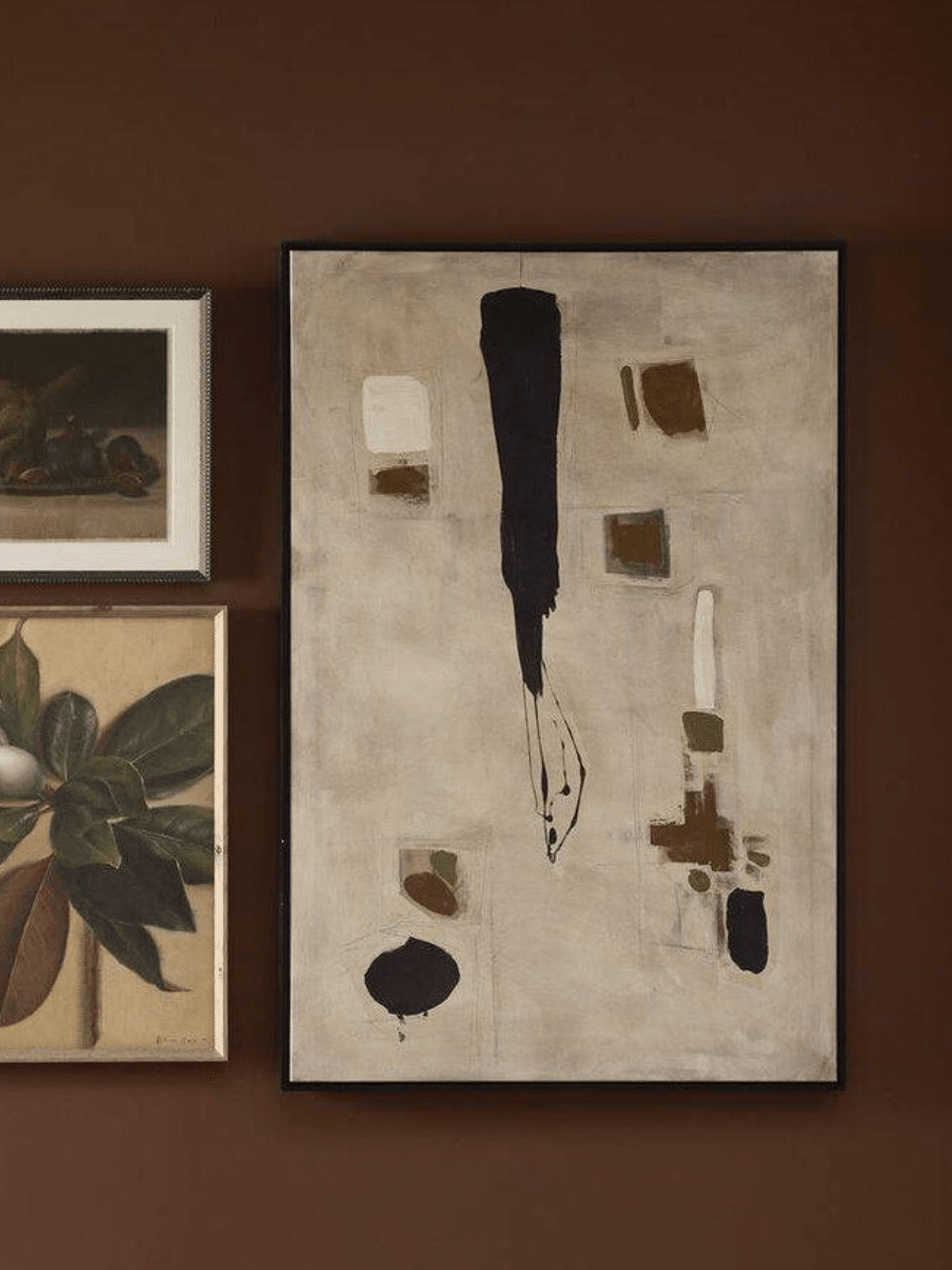
4. Anchor at Eye Level and Work Outward
When you’re ready to hang, start with your hero piece — your largest, most visually dominant frame — and hang it first. The center of this piece should sit at roughly 57 to 60 inches from the floor, which is standard eye level for most people standing in a room.
From there, work outward in all directions, maintaining consistent spacing. A gap of two to four inches between frames usually works best. Closer spacing feels more intimate and curated; wider spacing feels more airy and modern. Neither is wrong, but pick one and stick with it throughout the arrangement.
As you add pieces, step back frequently. The arrangement will develop its own logic as you go — you’ll start to feel where each piece wants to land.
Spacing Tip:
If your pieces vary a lot in size, try keeping the outer edges of the arrangement relatively even, almost like an invisible rectangle of oval shape, while letting the interior arrangement be more organic. This creates a sense of intention without rigidity.
5. Mix Sizes, Orientations, and Materials
A gallery wall of identically sized frames, all hung at the same height, can feel a little flat. What gives a collection life is variety in scale, orientation, and ideally, material.
Mix portrait and landscape orientations. Pair a large statement piece with a cluster of smaller prints. If you’re including only framed art, consider adding one unexpected element: a small mirror, a sculptural wall piece, a woven textile, or a mounted object that has meaning to you. These breaks in the two-dimensional plane add real depth to the wall.
That said, variety doesn’t mean anything goes. Come back to your unifying thread. Mix freely within it, and the wall will feel collected rather than cluttered.
6. Hang with Confidence (and the right hardware)
Once your templates are on the wall and you’re happy with the layout, hanging is straightforward, but there are a few tips worth knowing.
- For heavier pieces (anything over five pounds), use wall anchors or locate a stud. It’s worth the extra five minutes.
- A level is your best friend. Even pieces that look straight to the eye often aren’t, a small level takes the guesswork out entirely.
- For arrangements with many pieces, hang from the center outward, just as you planned on the floor.
- If you’re hesitant to make holes, adhesive hanging strips rated for the weight of your frames are a possible solution.
Once everything is up, step back and look at the wall as a whole rather than piece by piece. Make small adjustments — a frame tilted slightly, a piece that wants to move an inch left. Then leave it. Gallery walls are meant to be lived with, not perfected.
Room-by-Room Ideas
Living Room
The wall above your sofa is the most natural home for a gallery display. Keep the arrangement within the width of the sofa, or a little wider, and aim for the overall collection to feel balanced even if the individual pieces aren’t symmetrical. This is the room where a slightly larger, more dramatic collection works beautifully.
Dining Room
A gallery wall in the dining room is a natural backdrop for dinner conversation, and because dining rooms tend to be viewed from a seated position, hang your anchor piece slightly lower than you might elsewhere — closer to 54 inches from the floor.
Primary Bedroom
Gallery walls in the bedroom tend to feel most personal. This is the place for family photographs, meaningful artwork, and pieces from travels. Keep the palette calmer here, as artwork with too much visual energy can feel restless in a space meant for relaxation. The headboard is a classic placement, and works especially well when the collection mirrors the width of the bed.
Stairways
Staircase gallery walls grow organically over time and can follow the natural rise of the stairs. Almost any arrangement works, making them a great place to display sentimental pieces that might feel too casual for more formal areas.
Hallways
Hallway gallery walls are some of the most forgiving spaces in the home. With their flexibility, they’re perfect for mixing styles and showcasing meaningful pieces that don’t need to fit a strict design scheme.
Entryway
A gallery wall in an entry makes an immediate impression. Because entryways are typically narrow and viewed in passing, the collection can be tighter and taller than elsewhere. This is also the perfect home for a mix of sentimental and decorative pieces — family photos alongside artwork, a small mirror that’s also functional.
When in Doubt, Our Designers Are Here
There’s a reason gallery walls can feel intimidating: scale, proportion, and personal taste are all in play at once, and it’s hard to see all of it clearly when you’re standing in your own living room.
That’s exactly when our design team loves to get involved. Whether you’re starting from scratch or looking to refresh an existing arrangement, our designers can help you think through scale, cohesion, and placement — and help you find the art and frames that pull it all together.
We’d love to help you build your gallery wall that feels genuinely personal.



 Your Privacy Choices